
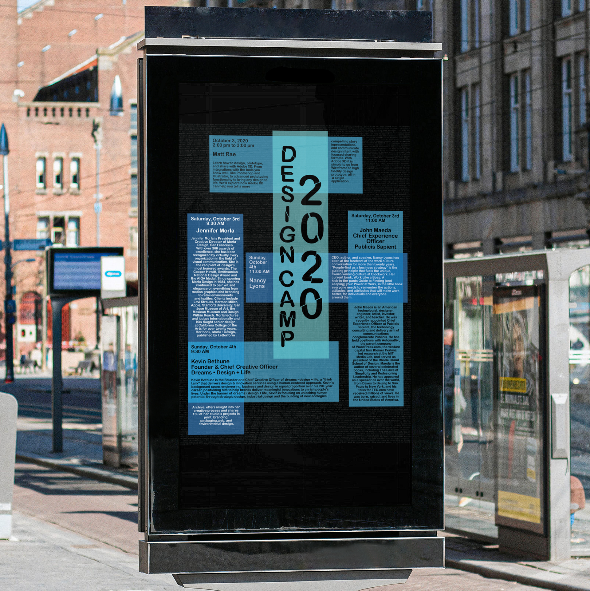
This poster was designed as an advertisement for a design camp. The whole poster is built to have type as the main visual element. The color palette is kept simple with black, white and a few shades of blue used, this along with the geometric sharp shapes used in this design are meant to create a clean editorial look. the texture on the background is "lorem ipsum" in a light grey on a black background, the type is also upside-down and small to avoid attracting too much visual interest, but this pattern adds a little bit of texture and detail to this piece while still using type as the primary design element.