Phase 1
Phase one is mostly meant to analyze the original website and find things that can be bettered or changed and getting a good idea of the current layout and branding of the site. This includes doing a competitive analysis, site mapping, doing a user experience map and
Web Mapping
Web mapping is a great start to analyzing a websites content and layout. For this website the original site was one page with no menu and less than five connecting pages.
User Journey Mapping
User journey mapping is an essential part of the first phase and is a crucial step in problem identification and solution creation. This particular website had most issues in the structure and organization of the site.
Problems & Solutions
After user journey maps are completed the next step is to look at the user journey maps and find the websites biggest problems and find solutions to them. For this website I had three problems I focused on.
Problem 1
Ticket Experience
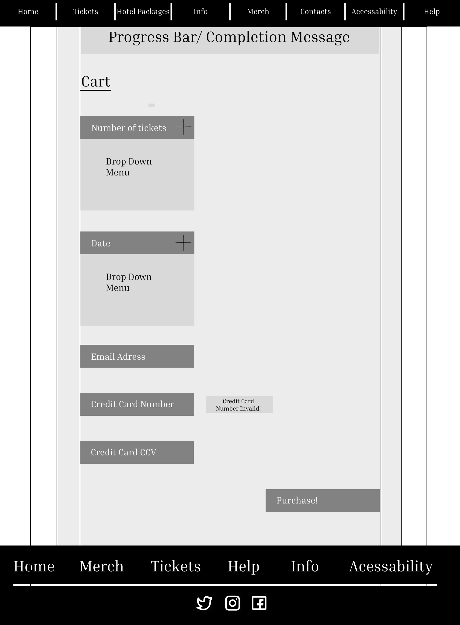
Problem 1 for this project was focused on the experience of an average attendee purchasing a ticket. The biggest problem found with the website was that the information about the tickets was hard to find. The ticket purchase process itself was unsatisfying.
Problem 2
Hotel Packages
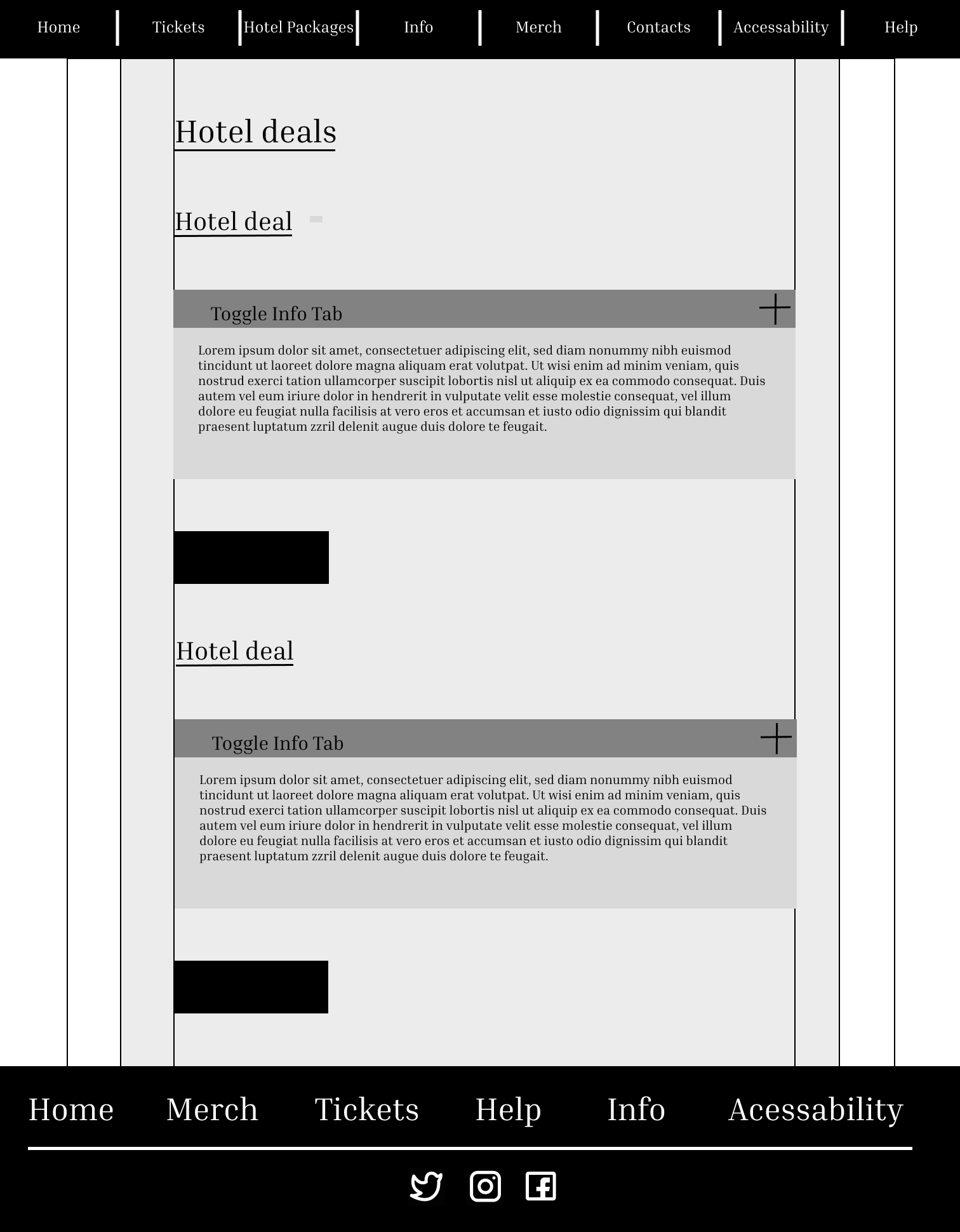
Problem 2 was similar to Problem 1 but instead of being focused on the ticket information and buying process it was focused on the hotel option buying process.
Problem 3
Accommodations
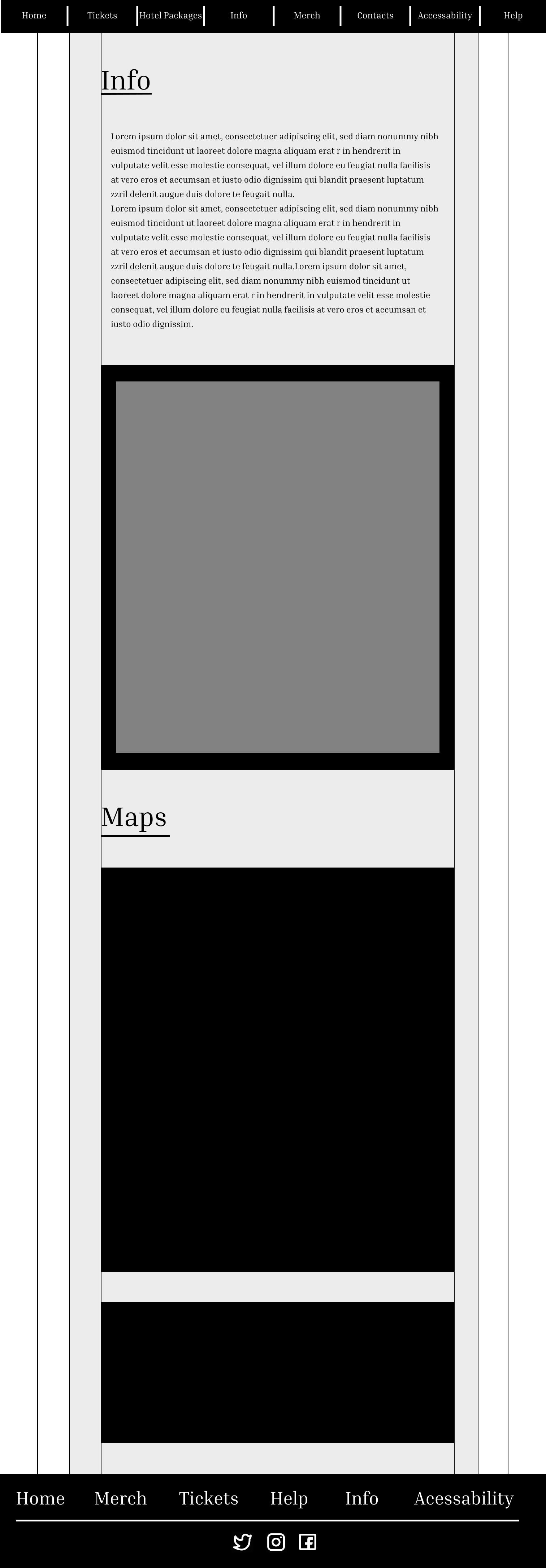
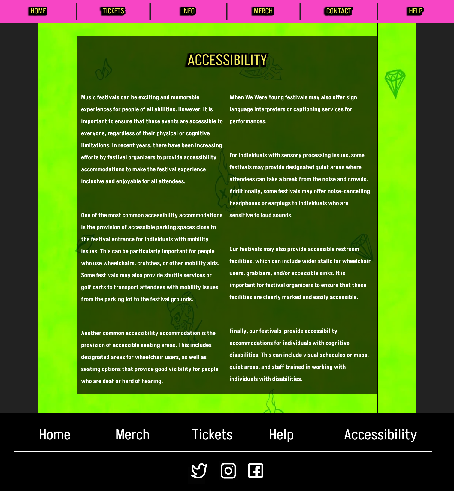
Problem 3 was focused on the accommodations content available in the website. The available information was sparse and hard to find, and no map was available on the website for accessibility needs.
Updated Web Maps
Web maps are a great way to plan out site changes and additions. My web map has changes significantly since we last saw it, Many pages have been added to the site making it much more complex and comprehensive.
Phase 2
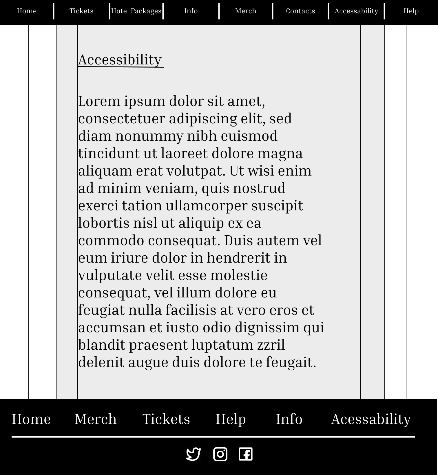
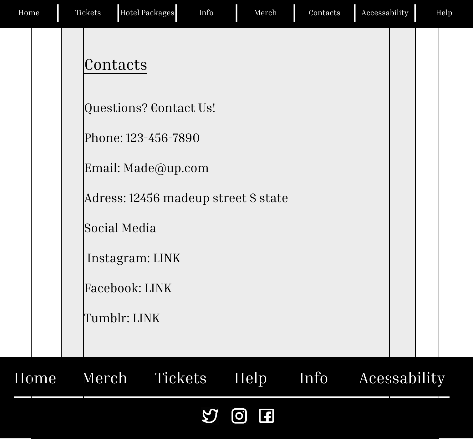
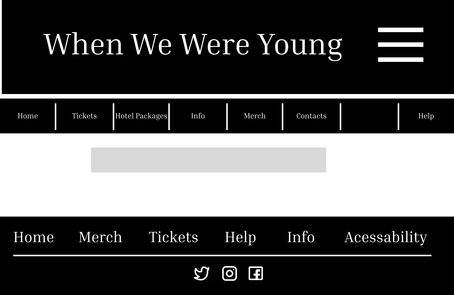
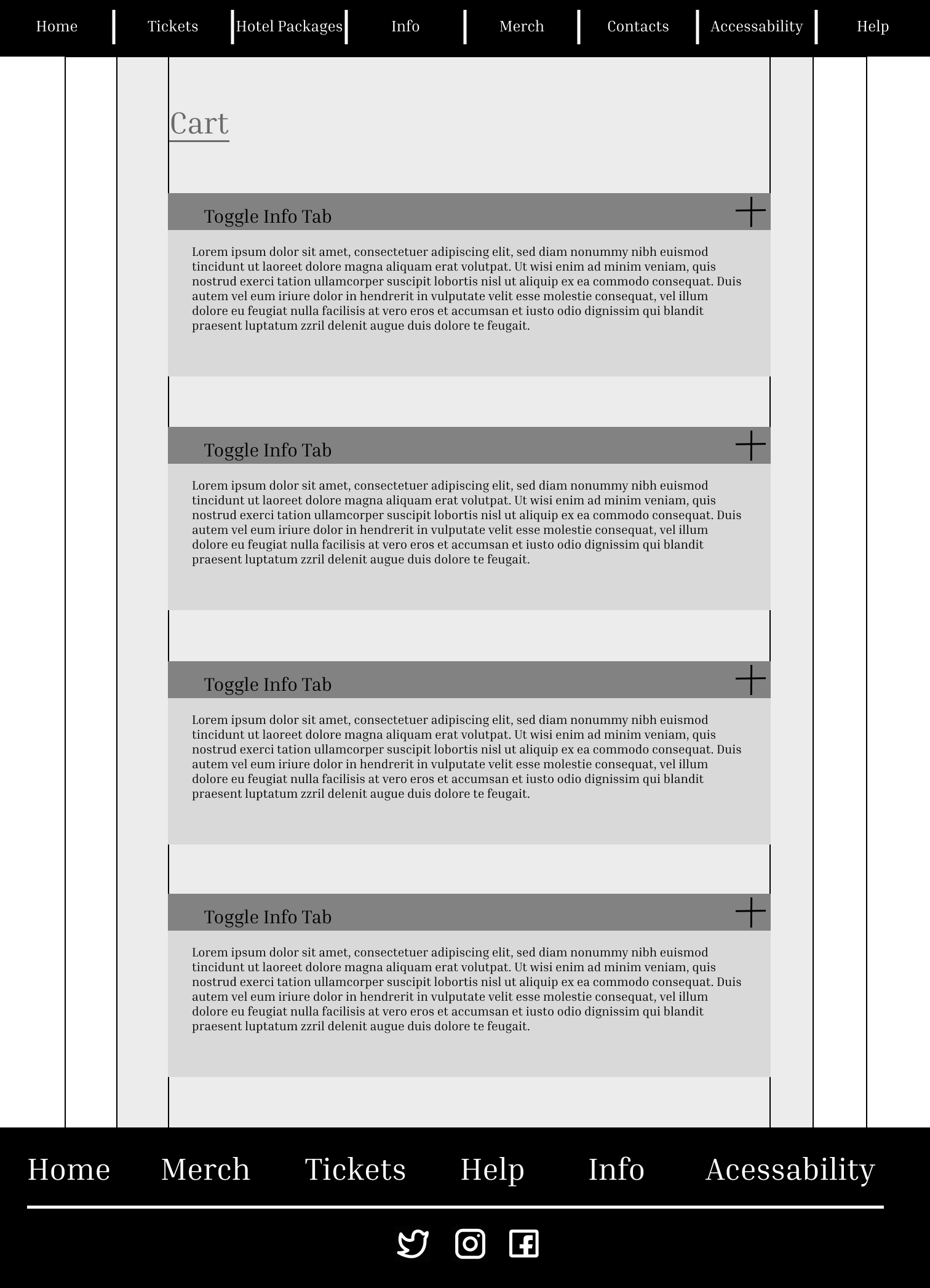
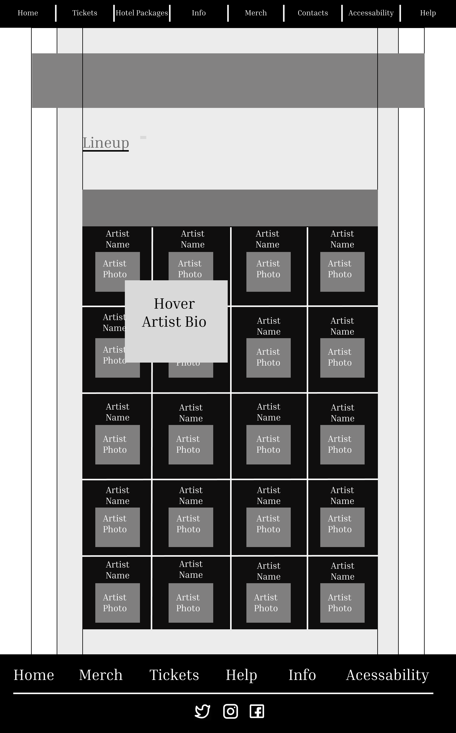
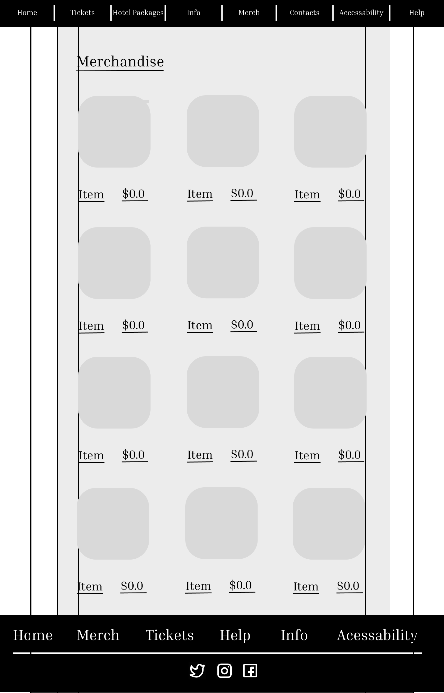
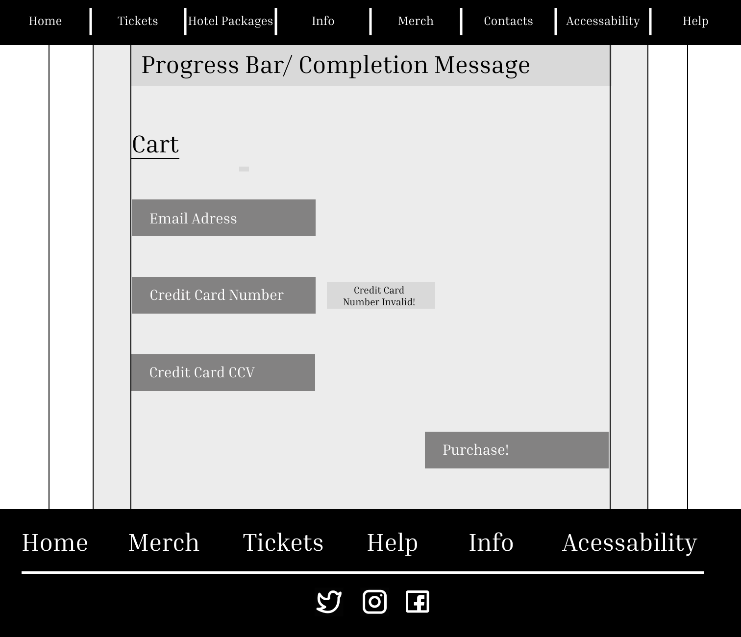
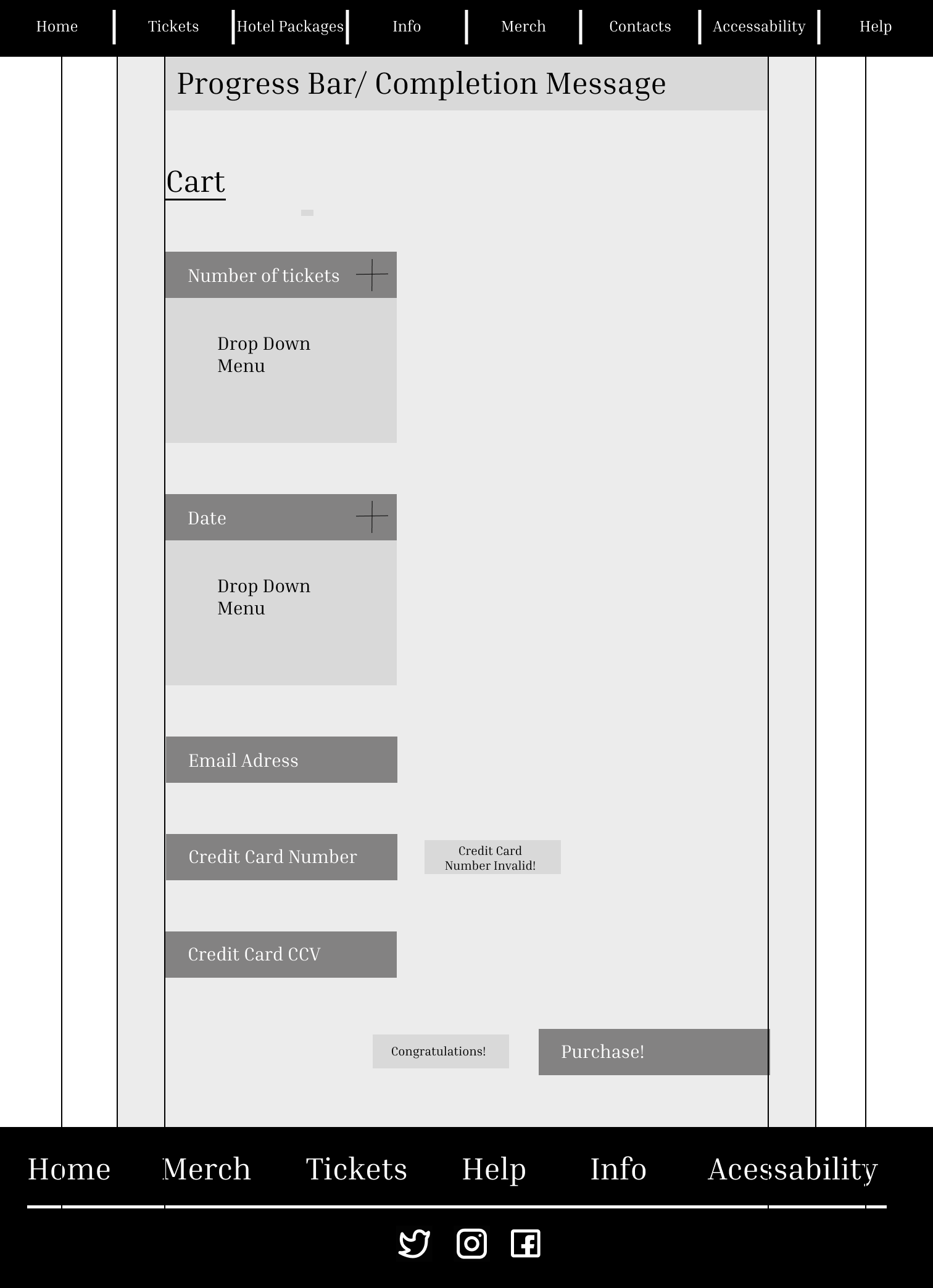
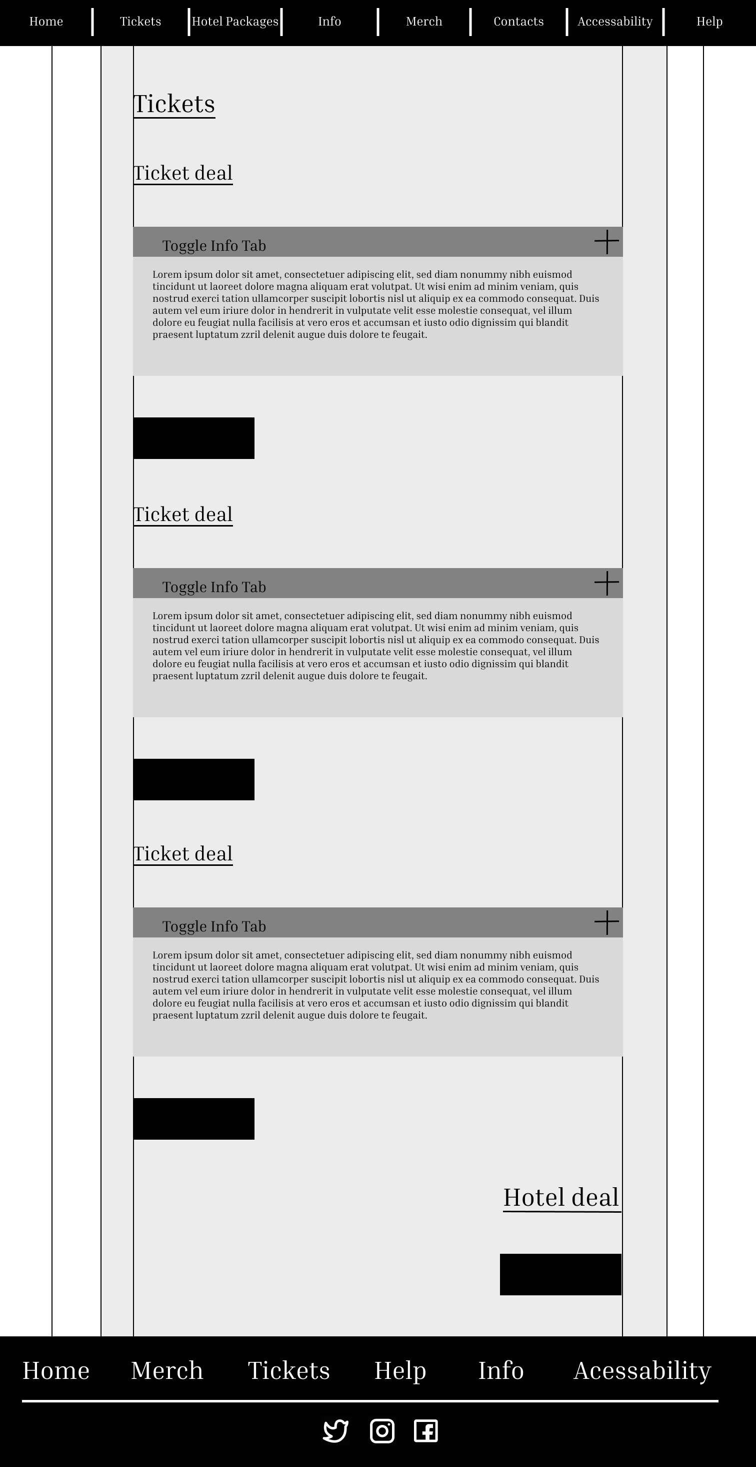
Phase two is all about lo-fi wireframes, basically digital sketches. This helps me to really map out where I am going to put content. These wireframes are in black and white because this stage of the project is all about function, and branding isn't really part of the picture yet. This helps me to really focus on layout and organization, making for a well thought out design, even before we start adding color and images. Of course, that doesn’t mean I'm not thinking about the branding while working on this base design. For example, the website I am re-designing has a very bright intense color palette , because of this I was careful to make sure everything has plenty of space and order to avoid a "Busy" look.
Phase 3
Phase three is mostly focused on branding and component building. This particular website has a very intense brand, and I wanted to really lean into that and present it in the best way possible. So I kept the bright color palette, I did end up making a few small edits to the colors though. Originally the website had many shades of pink all over the website. To create a more unified design, I chose to go with only two shades of both the pink and the green.
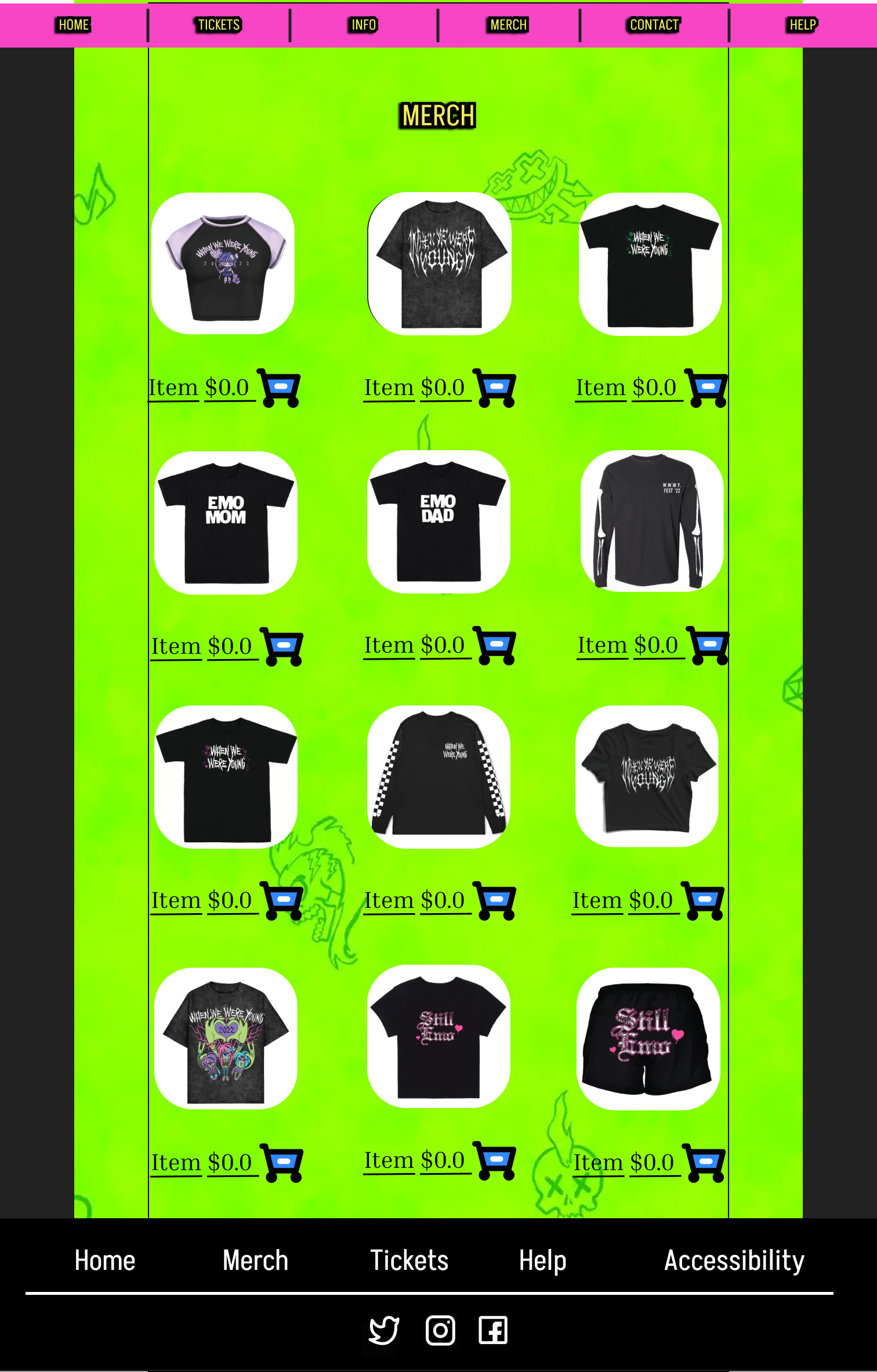
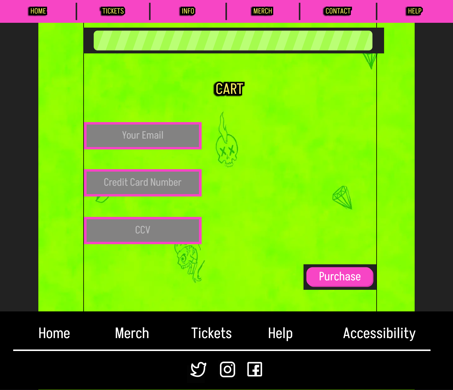
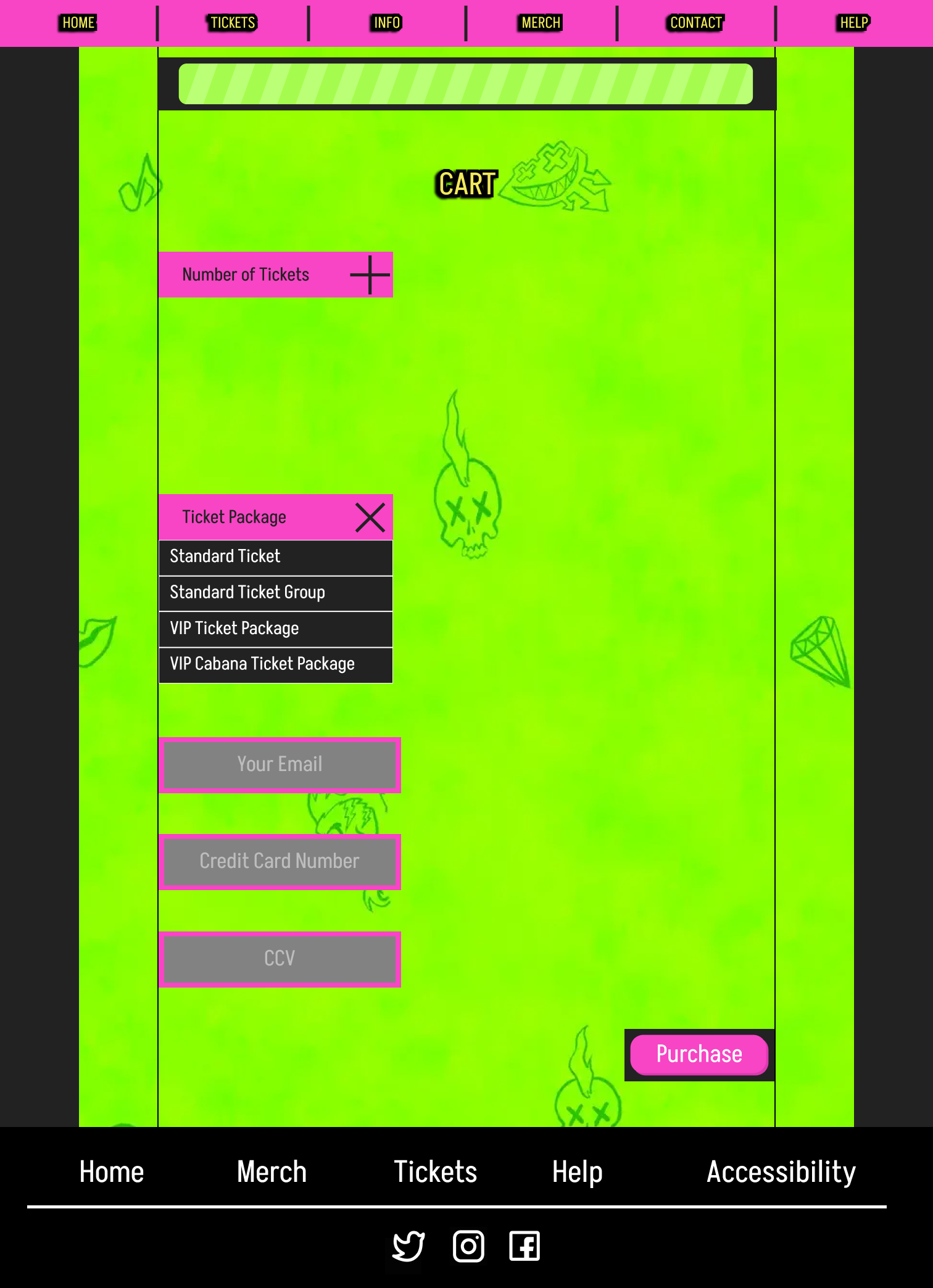
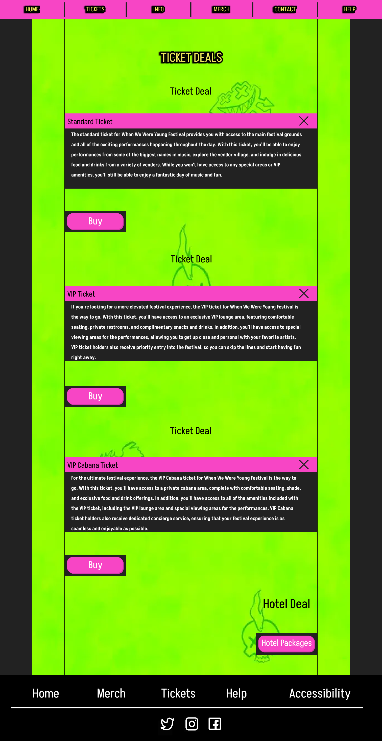
Component Building
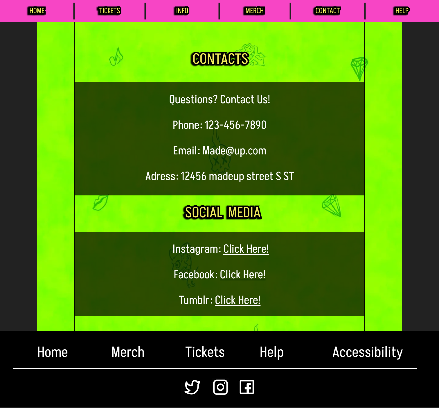
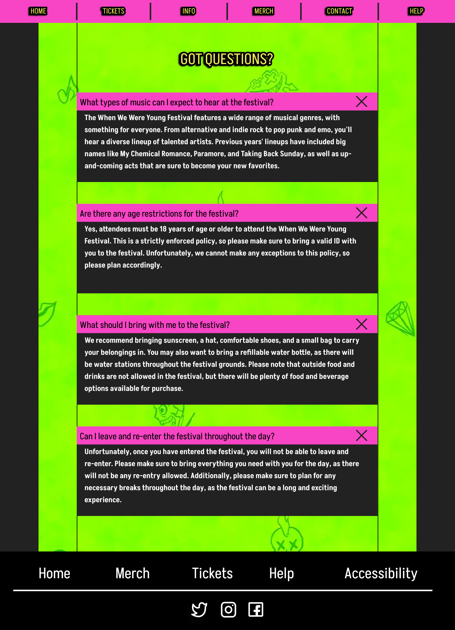
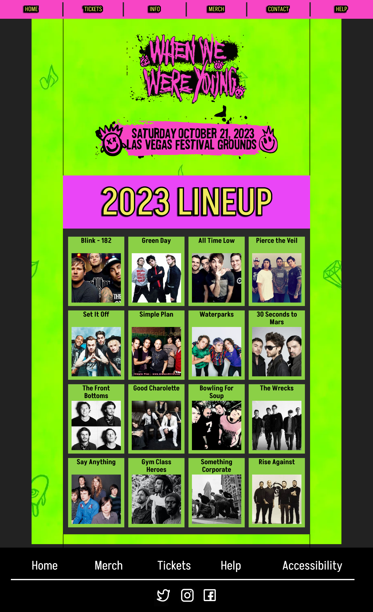
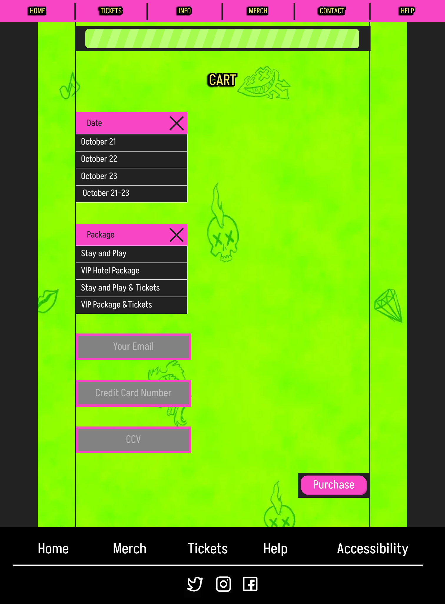
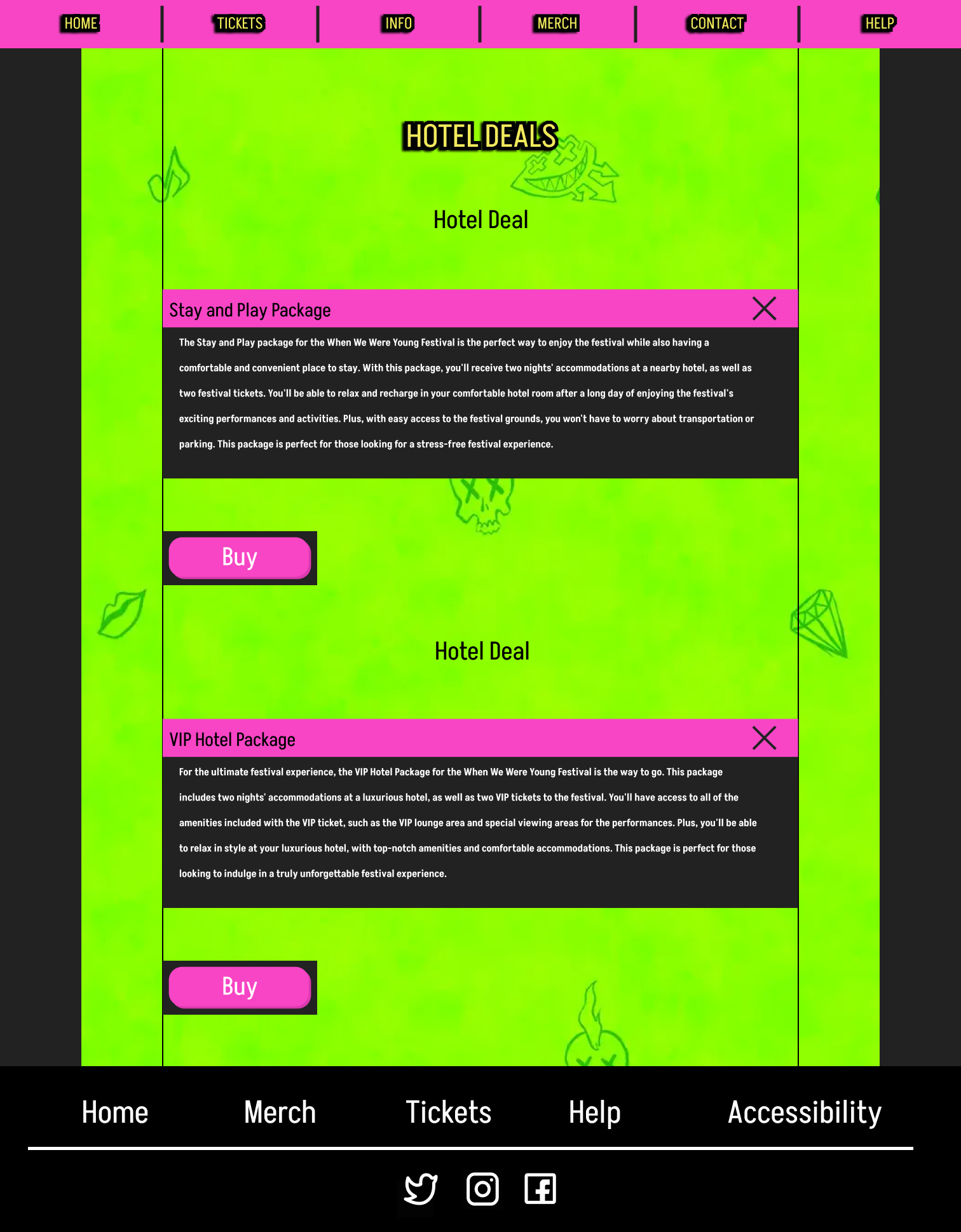
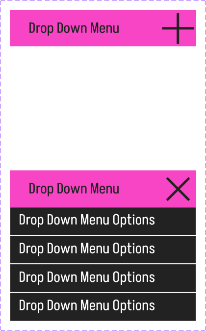
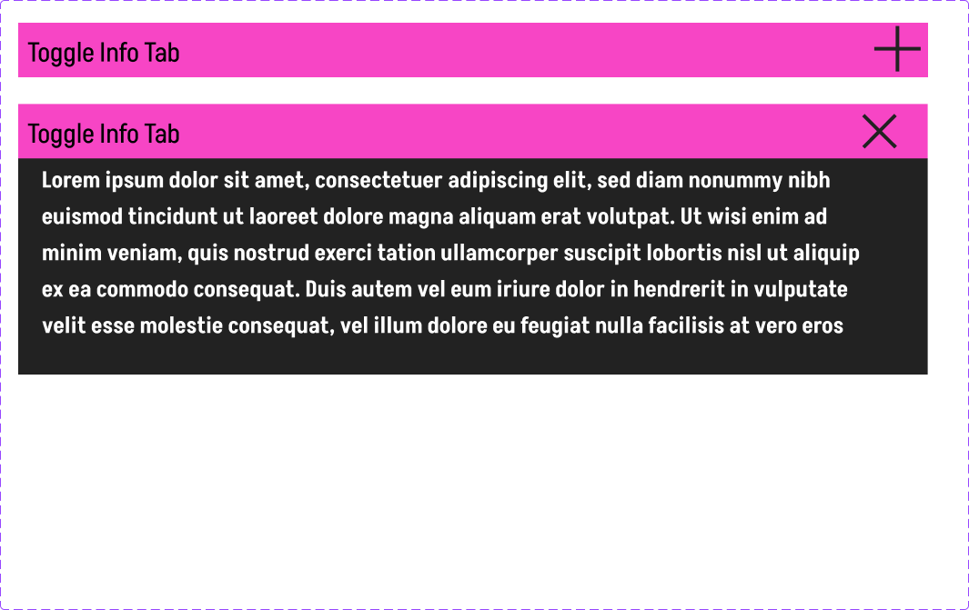
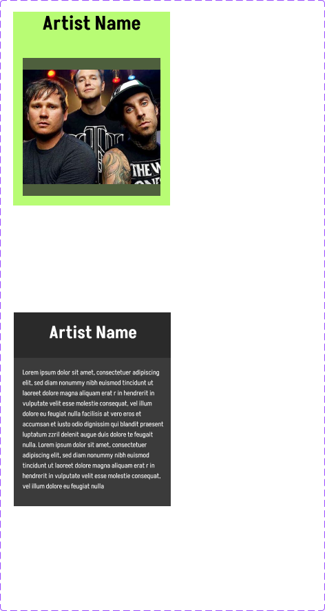
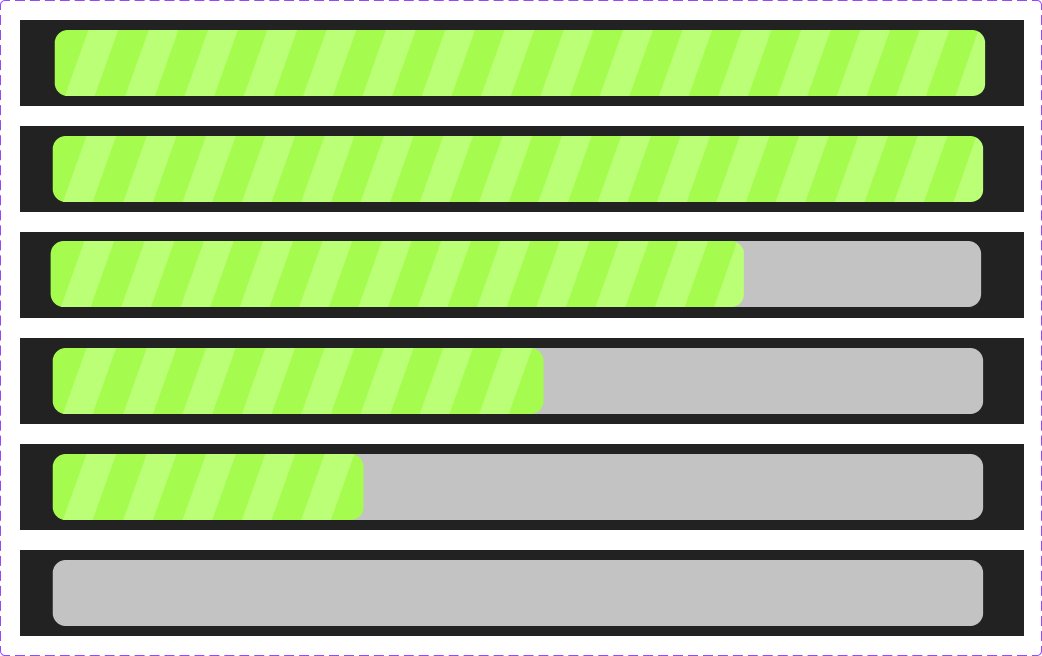
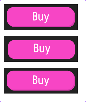
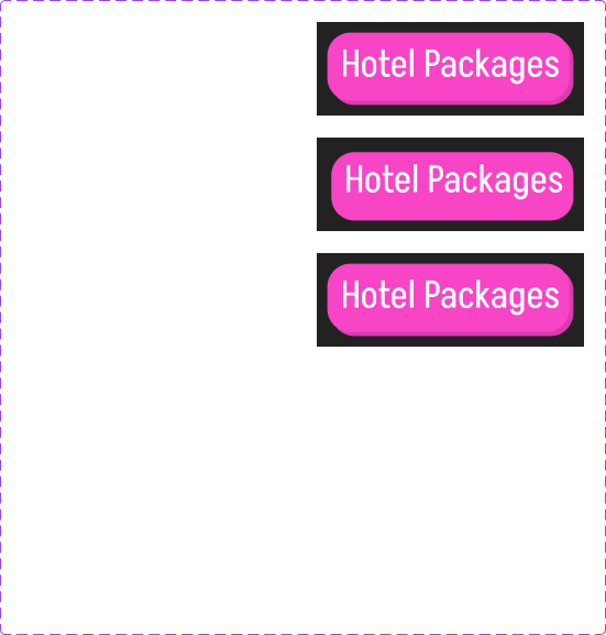
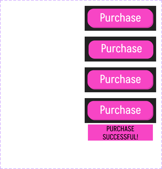
Component building is an essential part of this phase of a website redesign. Components are elements of a website that are either used in multiple places or animated. For this website I tried to build components that matched the brand of the current website. And then placed them around the site.





Phase 4
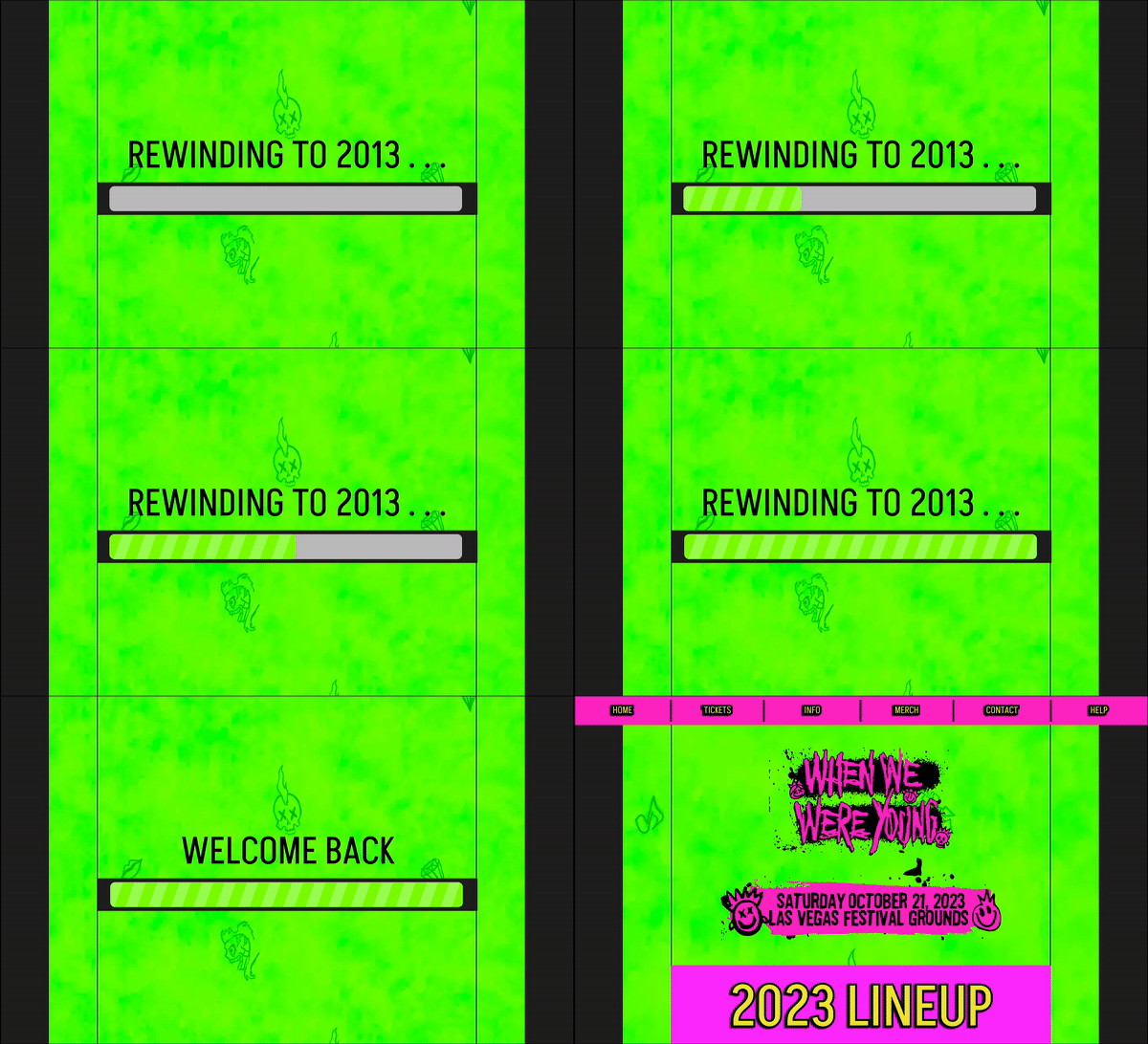
Phase 4 is one of the most satisfying phases, this phase is about bringing everything to life via animation and prototyping.
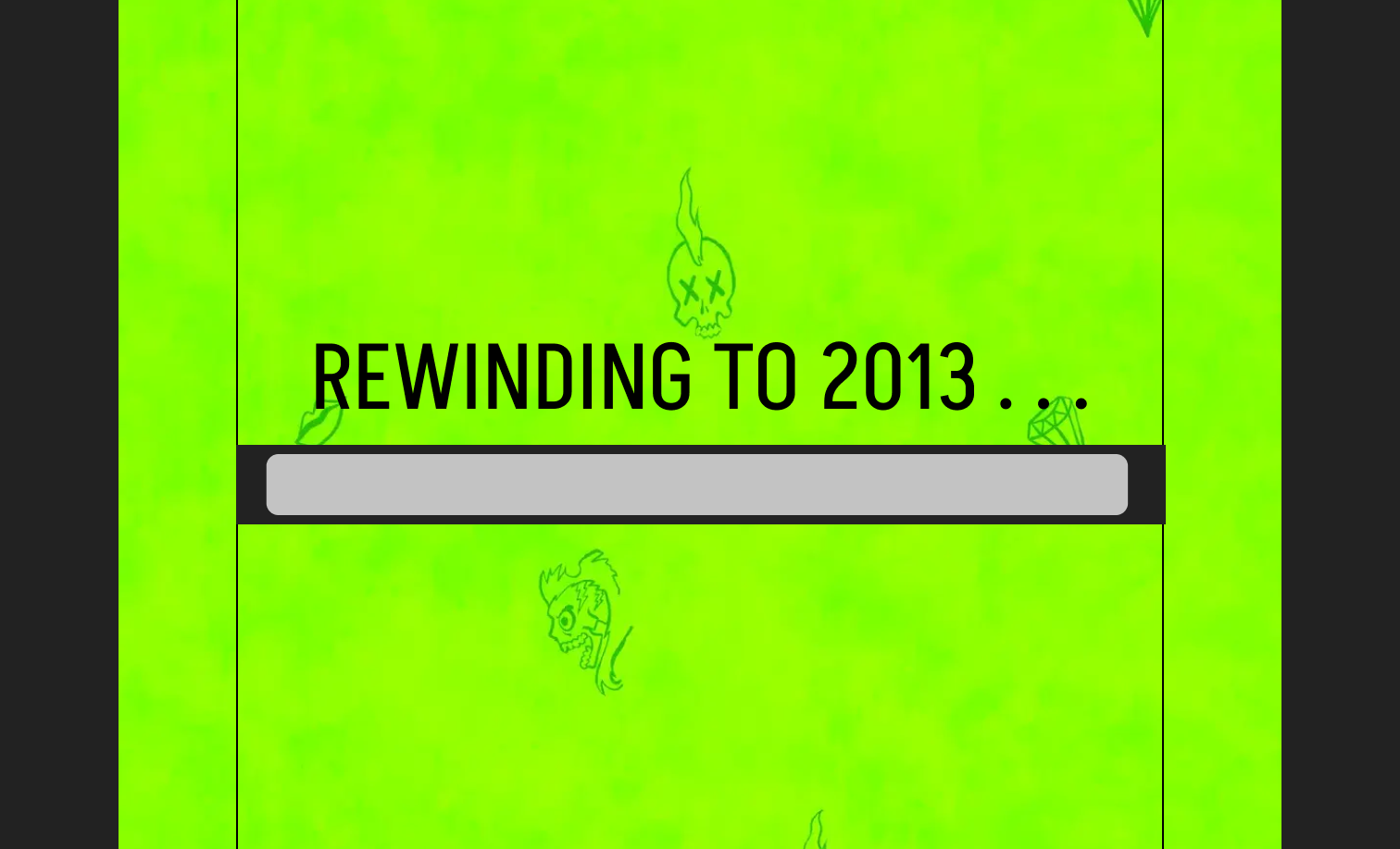
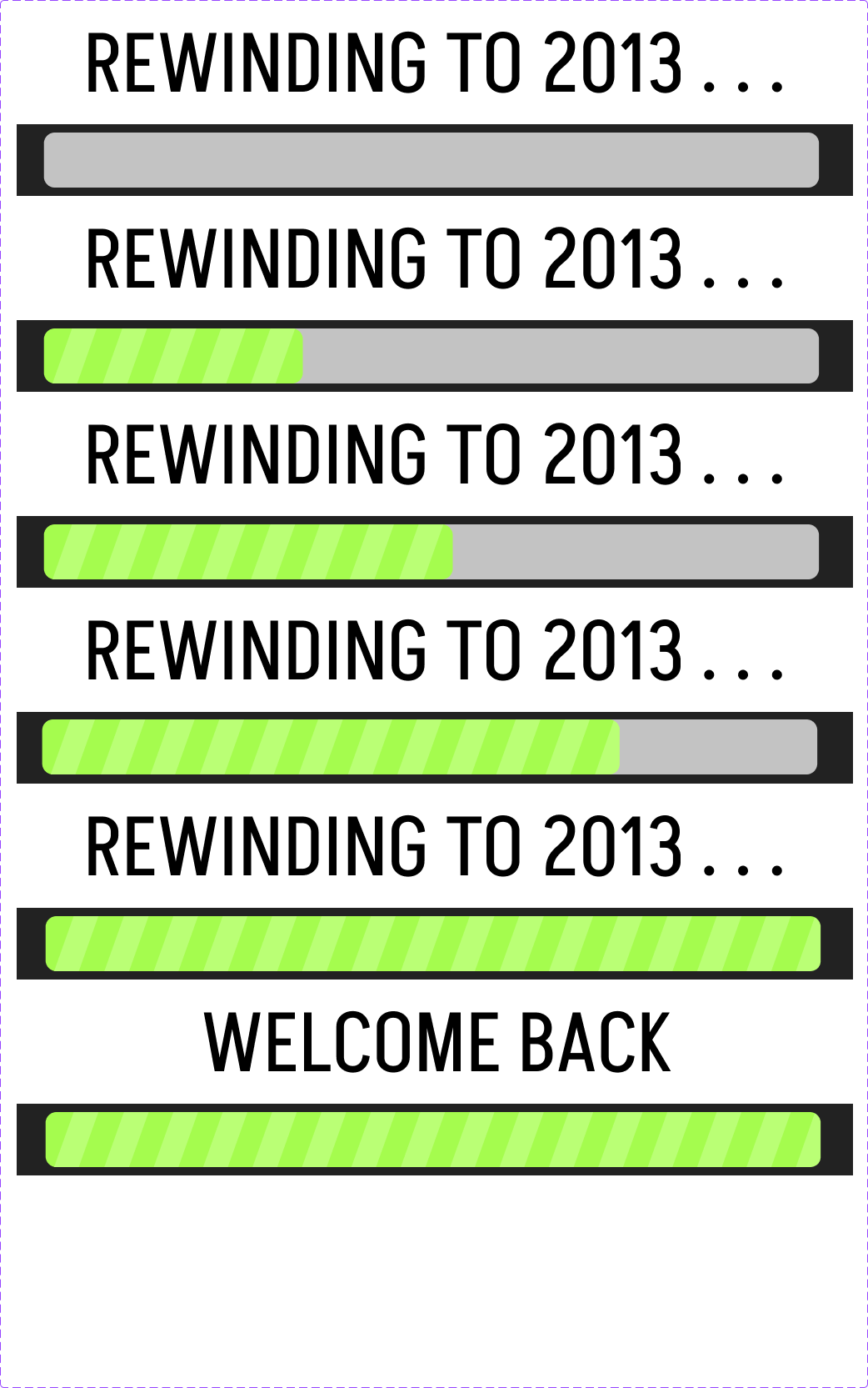
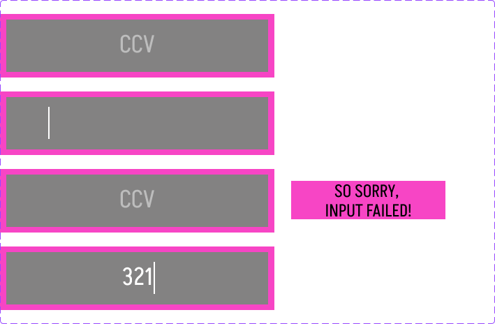
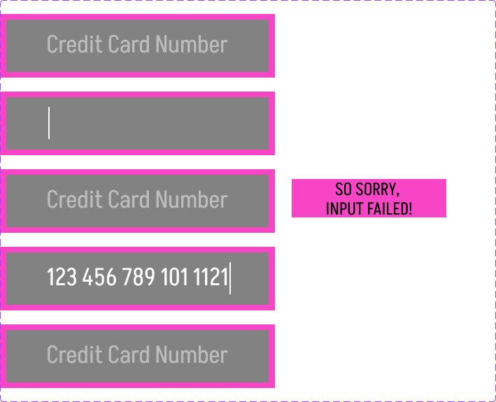
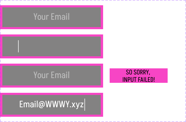
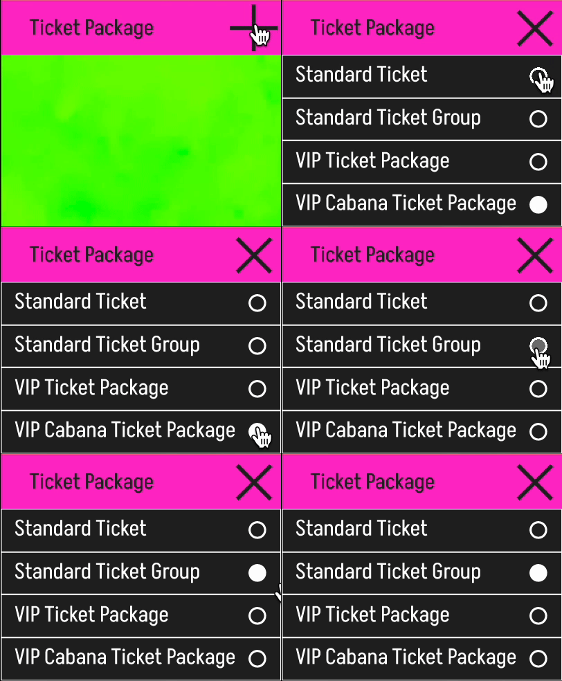
Multiple types of animation are used in a website. In this remake, I have both Micro and full page animations. Here are a few examples.


Problem 1
Ticket Experience
Problem 1 for this project was focused on the experience of an average attendee purchasing a ticket. The biggest problem found with the website was that the information about the tickets was hard to find. The ticket purchase process itself was unsatisfying. The solutions implemented for this problem were adding a page for tickets and putting that on the main menu.
Problem 2
Hotel Packages
Problem 2 was similar to Problem 1 but instead of being focused on the ticket information and buying process it was focused on the hotel option buying process. The solutions implemented for this problem, much like the last problem, were adding a page for tickets and putting that on the main menu.
Problem 3
Accommodations
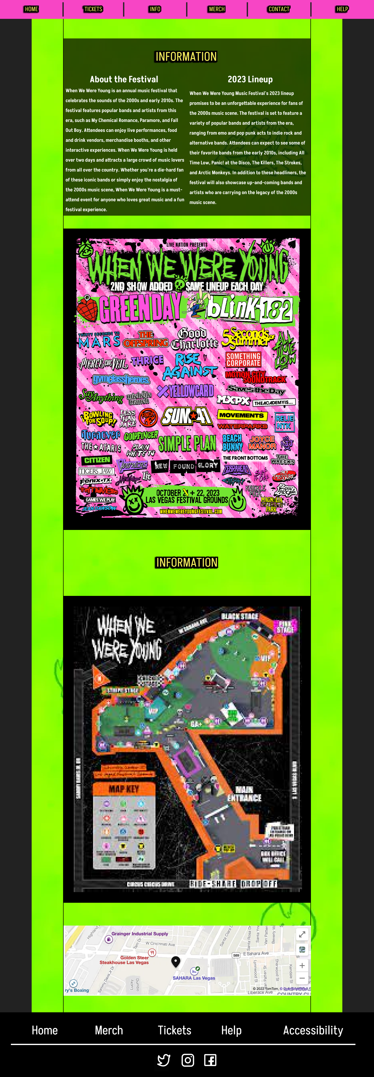
Problem 3 was focused on the accommodations content available in the website. The available information was sparse and hard to find, and no map was available on the website for accessibility needs. The solutions implemented for this problem were adding a map to the information page and also adding an accessibility page and adding a spot for it in the footer menu.
